Context and diagnosis
End of 2025, Anunta Tech commissioned me to lead a high-stakes product sprint: concept to Gartner-ready in two months, establishing Anunta's AI-era product position ahead of a Gartner event where prospective enterprise clients would evaluate the platform live.
The business problem was fragmentation. IT leaders at Anunta's enterprise customers had to log into multiple tools to see their organisation's digital health: separate surfaces for infrastructure, security, employee-experience telemetry, automation efficiency. AI Fabric would consolidate those into one pane of glass, track digital maturity using Gartner's framework, and deliver a single view a CIO could read in seconds.
The brief was strategic. Anunta was not just building another dashboard. They were placing a commercial bet that a genuinely CIO-grade AI-era platform would become the front of their managed-services offering, a visible layer that prospects would see in sales demos and existing customers would use every day.
I was solo on design, supported by Anunta's CTO, Head of PM, and two PMs assigned to the project. My role was broader than UX lead in the usual sense. Running stakeholder sessions, documenting and recording every product decision, surfacing potential pitfalls, resolving them before the clock ran out. In an eight-week sprint, decisions cannot re-litigate themselves. The documentation was the product's insurance against that.
One meta-detail shaped the pace. The EuVantage design system I'd built for Anunta in 2023–2024 was still in production across EuVantage Monitoring and Change Management. AI Fabric inherited it. Two years of compounding system investment meant the sprint could spend its design time on the novel part (the scoring mechanism, the four-vertical architecture, the AI agent layer), rather than on primitives, tokens, and component discipline. Nothing about the aesthetic was up for grabs. Everything about the thesis was.
Research
The research method matched the sprint. No user interviews, no ethnographic research, no multi-round customer-discovery cycles. No time for any of that. What the sprint allowed:
Stakeholder-session research. Many sessions with Anunta's CTO, Head of PM, and the two project PMs. The goal was to define the product end-to-end in those rooms: what it does, who it serves, what it shows, what it measures, how it integrates with Anunta's existing managed-services stack. Every session was documented. Every decision was recorded.
Pitfall surfacing. The other half of my role in those sessions was flushing out product-destroying decisions before they shipped. For a CIO-facing dashboard that would be judged by analysts and prospects in real time, one wrong scoring decision could kill the positioning.
Scoring audit. The sharpest observation came from auditing how early versions of AI Fabric were calculating their scores. Weighted averages, everywhere. Across subparameters within a vertical, and across verticals at the top level. Both layers were susceptible to the watermelon problem: the surface telling a friendly story the underlying data didn't support.
The example that reframed everything: average CPU utilisation across a large device population. A mean CPU value of 36% tells a CIO effectively nothing. If most devices run at 30% and a small fraction run at 95%, the average smooths the disaster out of sight. The reality (a small population of devices about to fail) is averaged away.
That observation landed mid-sprint. It reframed the product. Without the fix, AI Fabric would ship a dashboard that actively misleads CIOs, the exact category of product the Gartner event exists to reject. With the fix, AI Fabric would ship a dashboard that tells the truth at a glance, which was the original thesis. The sprint's remaining weeks went to making that fix real in math, in UI, and in an interactive prototype engineering could build against.
Ideation
Ideation in an 8-week sprint is compressed. Many decisions that in a longer engagement would have been explored across weeks were resolved in hours, in the stakeholder sessions, on the whiteboard. Two questions shaped the product most.
How should subparameters be aggregated?
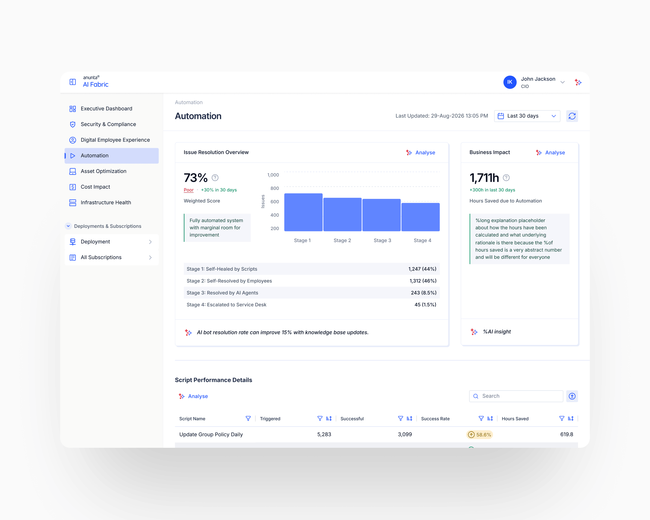
The early versions used continuous averages: mean CPU utilisation, mean memory, mean latency. The fix moved from continuous to categorical. Report the proportion of devices in a healthy range, not the mean value across the population. "92% of devices have healthy CPU" tells a CIO what they need to know. "Average CPU is 36%" doesn't. The aggregation unit shifted from the metric to the device. Every subparameter was redesigned under this principle: count the healthy, don't average the population.
How should vertical scores aggregate across subparameters?
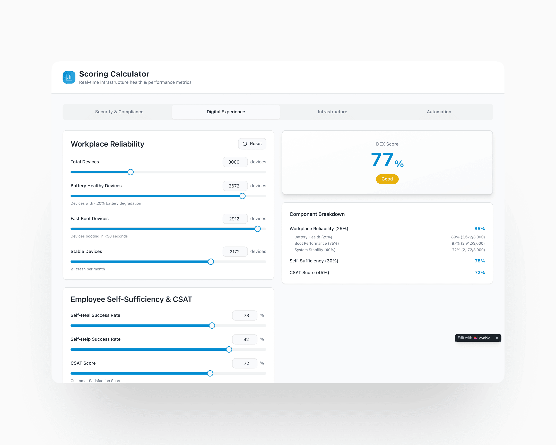
Weighted averages at the vertical level would reproduce the watermelon problem one floor up. A healthy-CPU score of 92% plus a healthy-storage score of 40% averages to a number that reads acceptable, when the real story is that storage is failing. The answer: weakest-link logic with configurable thresholds and caps. Each subparameter carries three configuration values: a weight (for the base calculation), a threshold (the minimum healthy value before the cap kicks in), and a cap value (the maximum allowable vertical score when the threshold is breached). A subparameter below threshold caps the whole vertical at its cap value, regardless of how strong the other subparameters look. The base calculation and the capped score display together; the limiting subparameter is named.
The weakest-link pattern itself isn't original. It's the logic behind Microsoft's Windows Experience Index and similar bounded-score systems. What's original is the per-subparameter configurability (every parameter has its own threshold and its own cap, calibrated to its criticality), and the interactive calculator that let stakeholders and engineers tune the math against real scenarios before a single production surface was built.
Execution
Four verticals, one pane of glass
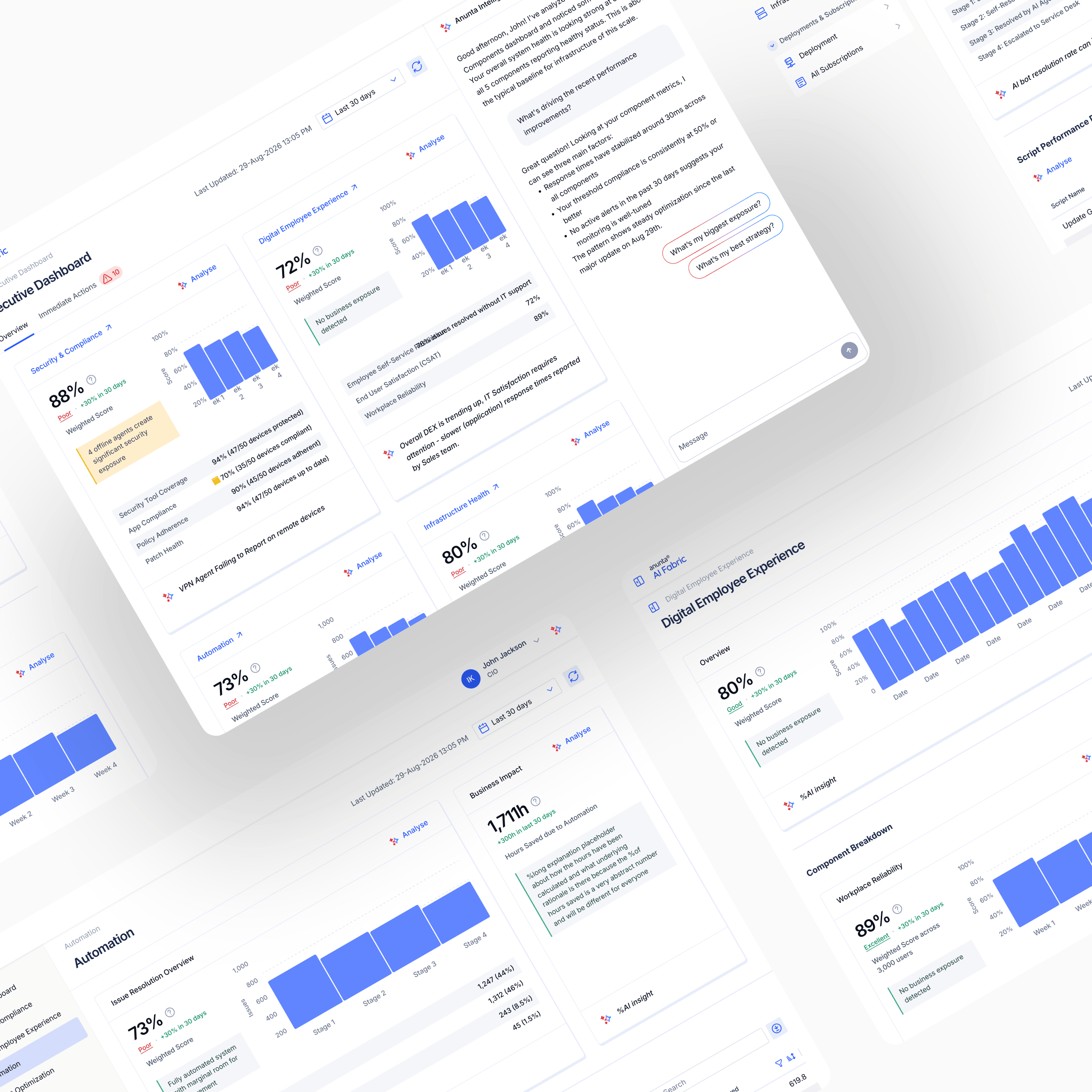
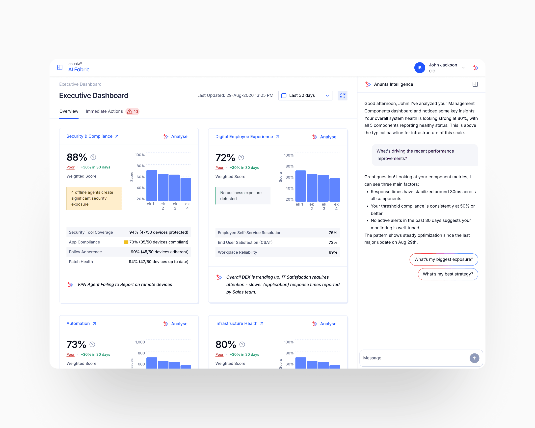
AI Fabric consolidates four verticals into one CIO-facing dashboard: Infrastructure Health, Security & Compliance, Digital Employee Experience, Automation Efficiency. Each renders as its own profile card at the top level of the dashboard: score, grade (Poor, Good, Excellent), trend direction, and a callout from the AI agent on what to investigate. Clicking into a card exposes the subparameter breakdown and the weakest-link cap, if one is active.
The design principle is that a CIO should be able to scan the top view in under ten seconds and know what's working, what's failing, and where to spend their attention next. Drill-down is for the analyst or the CTO. The top view is for the CIO.
The weakest-link scoring framework
The scoring framework is the case's load-bearing design innovation. Every subparameter carries three configurable values: weight, threshold, cap. The base calculation uses the weights to produce a weighted-average score. If any subparameter falls below its threshold, the vertical caps at the cap value specified for that subparameter, with the limiting subparameter named in the output.
Example from the shipped framework, Security & Compliance vertical: four subparameters (Security Tool Coverage, App Compliance, Patch Health, Policy Adherence) weighted 40/30/20/10 respectively. Each has its own threshold and its own cap. In one configuration, the base weighted calculation yields 86%; App Compliance at 70% is below its 85% threshold; the vertical caps at 70% (the cap specified for App Compliance); the output reads "Security & Compliance: 70%, Poor. Score capped at 70% due to App Compliance below 85%. Base calculation: 86%."
A CIO sees the true story instead of the flattering one. The sixteen-point gap between "86% base" and "70% capped" is the watermelon the framework prevents. Without the cap, the dashboard tells the CIO everything is fine; with the cap, the dashboard tells the CIO what to fix and why.
Subparameter-level redesign: continuous averages replaced with healthy-range proportions everywhere the averaging-hides-outliers problem applied. "92% of devices have healthy CPU" instead of "average CPU is 36%." The rule applied across CPU, memory, latency, session response, security compliance, patch state, policy adherence: every metric that previously got averaged.
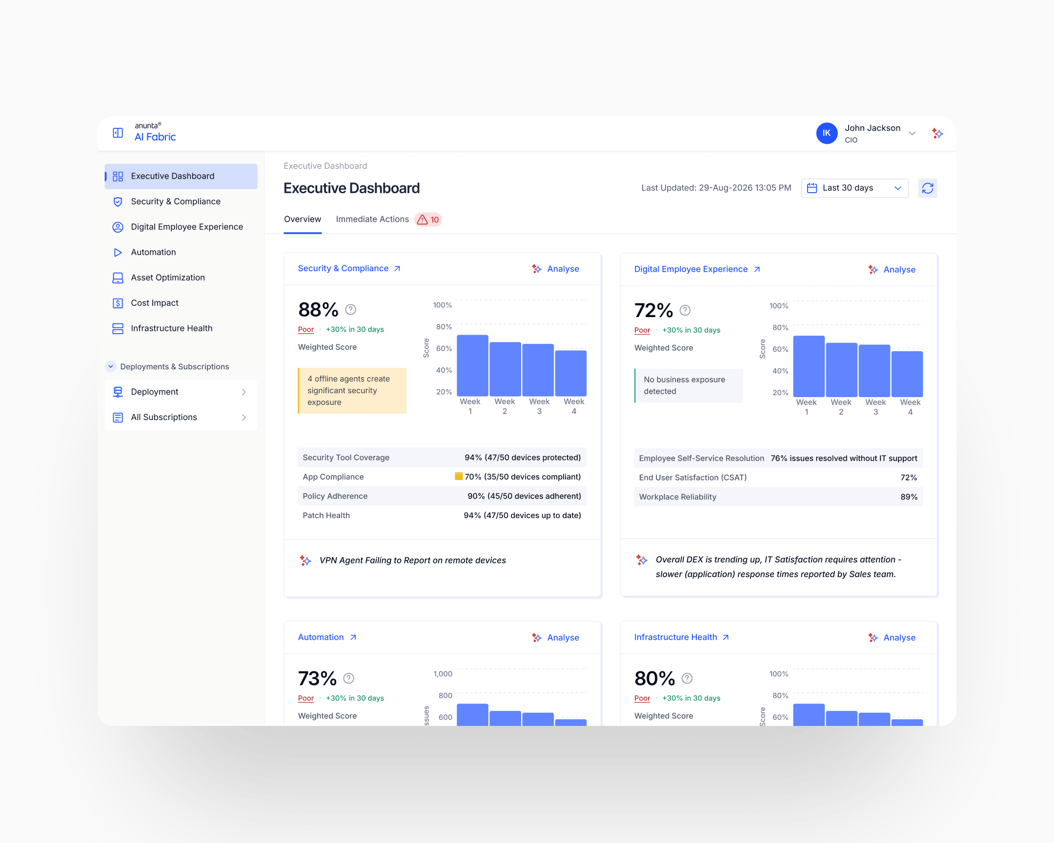
The scoring calculator prototype
The scoring framework was delivered to engineering as an interactive scoring-calculator prototype: a working app, not a spec document. Engineers could load any input configuration, watch the weighted base and the capped output diverge, adjust thresholds and caps live, and understand the math end-to-end before implementing it. The prototype sat alongside the written design spec as the authoritative reference.
This was design-for-engineering at sprint speed. The prototype itself was built in Lovable, AI-assisted code rather than a designed app: rough on visuals, internal-only, never intended to ship a pixel. What it bought was handoff velocity.
A dev reading about per-component thresholds and caps takes longer than a dev playing with the math for thirty seconds. Given the eight-week window, an AI-built calculator was faster to produce than the long-form spec would have been to defend, and faster for engineering to absorb than either. It also protected the math against interpretation drift. Engineers implementing from a prototype don't accidentally ship a subtly-different version of the logic.
The AI agent insight layer
Each vertical card carries an AI-generated insight: what's driving the current score, what changed, what the recommended next action is. The agent reads the same data the scoring framework reads, but translates it into plain language. "App Compliance is limiting your Security score. Three recently deployed apps haven't passed compliance review."
The design problem with AI agent insights on an executive dashboard is credibility. A CIO who has been burned once by a misleading AI insight will stop trusting the whole dashboard. The mitigations shipped: insights cite their source data (what subparameter, what timeframe, what threshold), tie back to the weakest-link output so the user always sees how the insight connects to the score, and stay conservative on predictive claims: surfacing what has happened rather than what might.
The EuVantage design system, compounded
Every surface of AI Fabric was rendered in the design system I'd built for EuVantage two years earlier. Typography, colour tokens, severity language, layout templates, navigation patterns, component library: all inherited. Nothing about the aesthetic was up for grabs, which is why nothing about the aesthetic slowed the sprint down.
The compounding-system claim made in the EuVantage case gets its empirical proof here. A design system built in 2023–2024 enabled a two-month foundational product build at the end of 2025 for the same client. Three products now ship on the EuVantage system: Monitoring, Change Management, AI Fabric. CloudOptimal sits alongside on its own system, authored separately for a different surface. Two design systems for one client, one compounding chain now in its third engagement.
Impact
Shipped outcomes
Concept to Gartner-ready in eight weeks. The product hit the Gartner showcase on schedule as a functioning, demonstrable single-pane-of-glass platform with a scoring framework that holds up under CIO-level scrutiny.
The commercial outcome reaches beyond the event. AI Fabric has become a major booster to Anunta's managed-services business through three reinforcing mechanisms. As a sales instrument, it demonstrates Anunta's observability capability in prospect meetings. CIOs see the consolidated view live and sign for managed services. As part of the managed-services deliverable, customers who subscribe get the platform as an ongoing part of the agreement, so the value is visible to their CIOs daily instead of surfacing only in quarterly reports. As an internal tool for Anunta's own team, engineers and account managers use it to deliver better service: fleet-wide customer health in one view, faster response, fewer things missed.
The internal empowerment has turned out to be the strongest of the three angles. A front-line operations team with a better dashboard delivers a better managed service. The product makes Anunta's own people sharper; the managed-services outcome follows.
Compounding outcomes
The case's own compounding story is that AI Fabric would not have been feasible in eight weeks without two years of prior design-system investment. The EuVantage design system carried over fully; the sprint's design time went to the scoring framework, the AI agent insight layer, and the four-vertical architecture, not to primitives, tokens, or component discipline.
The EuVantage system, built in 2023–2024, now carries three products: Monitoring, Change Management, AI Fabric. CloudOptimal (2023) ships on a separate system, authored earlier for a different product surface. Two design systems for one client, four foundational product builds across them, one designer-plus-client relationship now in its third engagement.
Takeaway
The watermelon problem is a product-coherence problem dressed as a math problem. A weighted average is a polite version of the truth. Politeness is the wrong design choice when the person looking at the dashboard is accountable for the failures the math is smoothing over. Weakest-link logic isn't clever. It just refuses to average its way past the thing that most matters.
Two months concept to Gartner-ready was only possible because two prior years of design-system investment meant nothing about primitives, tokens, or component discipline slowed the sprint. Foundational design at speed is the compounding return on foundational design done years earlier, by you or by someone else.